Posts

Showing posts from 2008

Mix 10K Coding Challenge - Few Tips I have used to limit the code size

Image
While developing for the  MIX 10K coding challenge , the major challenge to face is to limit the code in 10K size. So I had to question each and every line of code that would it be possible to write this even with fewer bytes.  Check out my application at  http://2009.visitmix.com/MIXtify/TenKDisplay.aspx?SubmissionID=0044  Make sure to run the application in fullscreen mode.  Here I am compiling a list of tips and features I used to reduce the code size.  1.       Automatic Properties - Used this .NET feature to create the Tweet class which represents an RSS feed item from the search result    public class Tweet {   public string Guid { get;set; }   public string Title { get;set; }   public string Author { get;set;     … …. 2.       Object Initializers new Tweet {Title = element.Element("title").Value, Author = element.Element("author").Value, Guid = element.Element("guid").Value}}; 3.       LINQ to XML - I have used this to read the XML stream from

Mix 10K smart coding challenge

Image
The Mix conference 2009 has organized a coding challenge on Silverlight/WPF with a restriction of using only 10Kb of source code. You can see the gallery of submissions at http://2009.visitmix.com/MIXtify/TenKGallery.aspx . Please visit and cast your vote for the entries you like, You can see my entry here. My application allows you to search the twitter feeds over the internet using Twitter Search APIs(basically same as what you can see at http://search.twitter.com/) What I am trying to acheive here with silverlight is just another way to visualize the search data along the time line travelling towards the negative Z-space . One more interesting feature I wanted to add to this in the future version would be to give the ability to navigate through the Z-space with mouse scroll to see the older results. This same kind of UX(user experience) can be used to view any sort of time based feeds like blog feeds or search results. Architecturally the application is utilizing the following maj

Paginated ObservableCollection

Image
ObservableCollection class makes the collection binding very easy in Silverlight or WPF. This special collection is aware of the binding infrastructures and notify them whenever some changes happens to the collection. I have often come across the requirement to have  pagination enabled on collections. When we bind a Collection with many items inside to an ItemsControl, the visual will be created for each and every items. But as we can see that there is no big significance in displaying all the data with a huge vertical scroll bar(or similar mechanism) in it. So pagination is the typical user experience strategy we use in this kind of scenarios. Architecturally we can achieve the pagination mainly in three different ways Making the UI Control or Panel aware of the virtualization, so that the visuals wont create at the time of binding. But as an on demand visual element creation. VirtualizingPanel concept in WPF is actually helps to achieve this idea. For more details about WPF virtuali

XAML Balloon Comments - Expression Blend Tip

Image
It is often a requirement in Silverlight and WPF that to create Balloon kind of UI for Toolip popups. It can be done in many ways. I am listing out few of the common Balloons you might be interested in.   < Grid             < Grid.RowDefinitions >                 < RowDefinition Height ="*"/>                 < RowDefinition Height ="30"/>             </ Grid.RowDefinitions >             < Rectangle RadiusX ="10" RadiusY ="10" Stroke ="#FF000000"/>             < Path Fill ="#FFFFFFFF" Stretch ="Fill" Stroke ="#FF000000" HorizontalAlignment ="Left" Margin ="30,-1.6,0,0" Width ="20" Grid.Row ="1"                 Data ="M22.166642,154.45381 L29.999666,187.66699 40.791059,154.54395"/>             < TextBlock HorizontalAlignment ="Center" V

Interactive Silverlight Greeting Card

Image
For the last couple of days I was trying to make an animated e-card using Silverlight. So here is the final result. The speciality of this card is that when we move the mouse over the card we can see it as if it is a 3D object and get the perspective view of the objects(Papervision 3D?). All the Trees and Mountains are Path objects and the particles falling down are random sized ellipses. I have used Microsoft Expression Blend to do most of this work Click here to see the Card in action. The important part of this Silverlight appplication is a Custom Panel called  SpacialArrangePanel . This panel will arrange its children based on two Attached Dependancy Properties. 1) HangingPoint - A point determines its X and Y position in the space 2) ZDistance - A double value determines how far the object is in the Z-plane. There is another DependancyProperty in the Panel called CameraPoint, which has been hooked to the Mouse Move points so that the mouse pointer acts as an Eye/Camera view point

Concave cornered Rectangle - Expression Blend Tip

Image
An expression blend tip to create a Path looks like a concave cornered rectangle.  Put a Grid with 5*5 rows and columns. and add 4 ellipse and a rectangle as in the following XAML. < Grid x : Name ="grid" > < Grid.ColumnDefinitions > < ColumnDefinition Width ="0.1*"/> < ColumnDefinition Width ="0.1*"/> < ColumnDefinition Width ="0.6*"/> < ColumnDefinition Width ="0.1*"/> < ColumnDefinition Width ="0.1*"/> </ Grid.ColumnDefinitions > < Grid.RowDefinitions > < RowDefinition Height ="0.1*"/> < RowDefinition Height ="0.1*"/> < RowDefinition Height ="0.6*"/> < RowDefinition Height ="0.1*"/> < RowDefinition Height ="0.1*"/> </ Grid.RowDefinitions > < Rectangle Fill ="#FF000000" Grid.Column ="1&qu

WPF Clock

Image
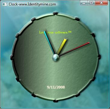
I had written a blog a long time back on creating a simple WPF clock . It was actually one my first few sample applications that I built when I got to fiddle with Expression Blend for the first time. Only today I noticed that the hyperlink to the Source code on the blog was actually broken for a long time and there are still quite a few asking me for the source code. So I am posting the same here with out even looking in to what I have done 1.5 years back :). Ofcourse I had to convert the source to VS2008(.NET3.5) Download the Exe Here and Source code

Desklighter - A handy tool for Silverlight

Image
As a silverlight developer I have often come across the need to demonstrate my work to others and post it to the Silverlight community. The options we generally use are listed below 1)You can just share the entire source code as a zip. But do you think most of the guys out there have the patience to download-compile-run the code? And sometimes you dont want to share your source code with the public. 2)Upload the application to a webserver But you need to have a webspace and ofcourse the website should support Silverlight. People always need connectivity to the website to run your sample. 3) A new way to share Silverlight Imagine that you could create an EXE out of Silverlight application and send that across your guys and get some comments to improve your work. This makes a silverlight application 'Offline' Sounds like a good idea? So Desklighter is your tool to do that. Deskllighter is a free tool from identitymine Sameer has a great post explaing more details about the deskli

Silverlight Marquee Control

My previous post describes about making a Custom marquee control in WPF. Here is what I tried the same using Silverlight. Silverlight is getting really mature with its latest releases, it has come pretty close to WPF in most of the scenarios. There is a difference with the way you create the Generic.xaml for writing the default look. You have to manually add the Generic.xaml to the project and set the build action as Resource file. See this blog for a detailed explanation of this. And the XAML code is still the same as what we wrote in WPF. The following code has to be added to the constructor so that whenever the control gets instantiated the default style will be associated with that. public Marquee() { DefaultStyleKey = typeof ( Marquee ); } The rest of the code is pretty much the same as WPF. I have added a Duration dependency property so that end user will be able to change the speed of the animation at run time. And subscribed to the mouse enter and leave so that animation w

WPF Custom Controls - Marquee control

Image
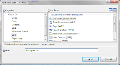
WPF and Silverlight have the cool idea of 'Lookless controls' which means you can skin a control in whichever way you like. Or in other words the UI rendering logic of a WPF control lives totally in a seperate world than the control's functionality. This enables a WPF applications capaibility to dress up in totally different skins and layouts at the run time. So let me explain the creation of a simple custom control by taking the example of a Marquee control. Hope you are well aware of the HTML Marquee tag. I am explaining the CustomControl concept of WPF with Marquee control as an example. Step to Create a custom control with VS2008 The above step will give you the class file and Generic.xaml added to the project. Who is your control Parent? First I should choose the base class from which my control has to derive from. I am seeing the Marquee as a control which holds up a content element always and the content gets scrolled horizontally. So I can say that ' Marquee con

Silverlight DeepZoom + AndreaMosaic

Image
Take a look at the Deepzoom page composed by Rob Burke using AndreaMosaic and Silverlight Deepzoom. This is such a great idea and to me this is going to be the major use of Silverlight Deepzoom technology. I am not sure that how many other software available out there which does photo mosaic. So I just tried to do one by myself. Bellow are the steps I followed 1) Installed AndreaMosaic and just follow the steps to create a photo mosaic file. You have to play little bit around the tool to undertsand what exactly is happening. 2)Open the DeepZoom composer (Can be downloaded here ) and arrange your photo mosaics in the order 3)Export the Deepzoom project to silverlight project 4)Publish that to Silverlight Streaming service Original Photo and the bellow deepzoom Silverlight(multiscale image) has around 1000 images in it. Check this out by drag and scroll your mouse. Or check out the Streaming version here

Podder Skinning - Another WPF Contest

Image
For the last two weeks I was a little busy with the WPF work for the Podder Skinning Contest by Josh Smith . Josh had a great WPF application architectured to support complete UI skinning. So all I had to do was to make some controls hooked up to his Model / Commands, and give it the look - that is the beauty of XAML/WPF. There are a series of posts he had made on theCode project explaining it really well The WPF Podcatcher Series - Part 1 (Introducing Podder) The WPF Podcatcher Series - Part 2 (Structural Skinning) The WPF Podcatcher Series – Part 3 (The Podcast Management Conundrum) The competition was annouced few months back but I was not sure about my time and availability and also I was not relieved from the hang over created by the previous contest - This needs more time out of my family:). Then I heard Josh has extended the deal line to Aug 4th. This time I decided to give it a try in two weeks . And here is the Source Code All my ideas were around the Aero glass feature of Vis

Finally the cool prizes have arrived!

Image
I received the prizes of the WPF Contest held by Lab49 . There are really some exciting items for a programmer on MS technologies. 1) Vista Ultimate 2) VS2008 3)Expression Blend 4)An 8GB zune player. etc

A Cool Control Template for WPF Button

Image
JellyButton_Theme.XAML Few days ago I happened to see this blog It shows a step by step instruction to create a nice glassy button in photoshop. Here is what I tried in expression blend to customize(control template) a button with the same look in mind. I have used few ellipses and 2 grid panels to make this effect. There is a Trigger functioning on it to show the interactions of the Press and Release action. Check out the XAML file to see the WPF button in action. You can open the XAML file in Internet Explorer if you are running in Vista. UPDATE : You can also check out my other blogs on Theme Check out the Silverlight version of the above here

A Simple Radial Panel for WPF and SilverLight

Image
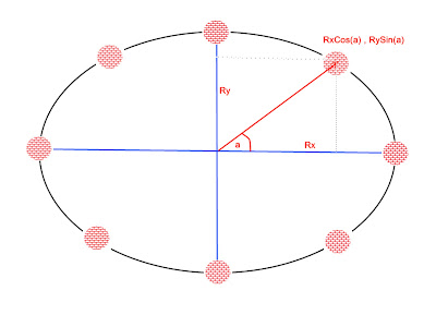
Geometry was one of the coolest topics in school for me. Probably because it uses a lot of figures to convey the concepts. Here I am trying to explain how we can leverage the Layout system in WPF and Silver light by taking an example of creating a Radial Panel. A RadialPanel lays out its children in a circular fasion. So before going in to the technical details, let us see how this problem get solved algorithmically.If you are asked to arrange a bunch of items in a circular path, what all things would you consider?. 1) How much space do I have? – Say X * Y rectangular area is the available size. 2) I will draw an approximate Circle (Or ellipse) inside the X*Y space. Assuming that the Radii are ‘Rx and Ry' 3) How many items are there to arrange? Say N – number 4) I know that 360 degrees are the total angular space for a circle. So angular distance between each item will be 360/N degrees. 6) I can calculate the coordinate point to which an item should be placed. That is by doing the

WPF Finance Contest Results Announced

I would like to share a good news that I have been selected as on of the finalists in the WPF contest , You can see the results and the download the entries here The Grand Prize winner : Szymon Kobalczyk Finalists : 1) Jacob Carpenter 2) Jobi Joy - thats me:) And the Honorable Mention went to Paul Hounshell

WPF Finance Application

Image
Here are some videos and screenshots of the application I build for the WPF Finance Contest. This Application will function as both Stock Ticker and Stock Analyzer tool. This has been designed to change Themes and Colors at run time. Stock Ticker The Application starts running as a Stock Ticker at first and shows up as the topmost window; user can move the ticker window by dragging the Clock on the left side of the window. User can right click on the Ticker Symbol to flip them and see the Intra-day line Chart. While in the Analyzer mode you can drag and drop Symbols to the Stock Ticker and the Scrips will get serialized and saved for the next session. Stock Analyzer By Clicking on a small arrow (Expander) at the bottom of the ticker, the user can switch in to the Analyzer mode. Now you can drag symbols from the ticker and drop on to the expanded area or Search symbol in the left pane and analyze. You can drag many chart symbols in to the Analyzing area and the Summary details will